Streamlining Ohh Look's Registration
.jpg)

The Challenge
CONTEXT
Ohh Look, a Southern California-based service directory, experienced a high abandonment rate during the provider sign-up process. Analysis revealed that the onboarding flow lacked clarity and intuitive guidance, resulting in low provider activation and missed revenue opportunities.
Steps to Signing Up as a Provider
.jpg)
Overwhelming Provider Profile - User Dropoff

My Design Process

Competitive Analysis: Identifying Industry Standards
COMPETITIVE
ANALYSIS
Through a competitive analysis of industry leaders like Thumbtack, Angi's List, and Rover, I identified key features such as real-time profile previews, segmentation, and collapsible forms that enhance user experience and reduce friction.
Major Usability Problems
Visibility of System Status:
Unclear steps and expectations.
Recognition Over Recall:
Language and labelling weren't intuitive.
Aesthetic & Minimalist Design:
Too many fields and no visual hierarchy.
Help & Documentation:
No tooltips, examples, time estimations or support for users .
Sketching Solutions
.jpg)


The Solution
STAKEHOLDER
COLLAB-
ORATION
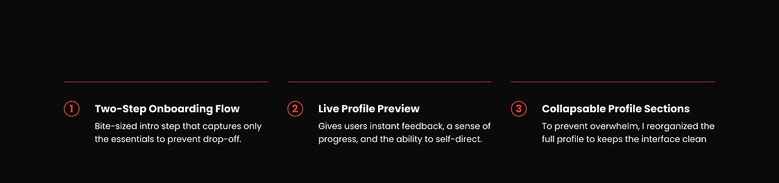
In collaboration with stakeholders, we identified opportunities to streamline the sign-up process by:
-
Eliminating time estimates to reduce perceived complexity.
-
Aligning the 'Go Live' button styling with brand identity for consistency.
-
Simplifying and repositioning the sign-up CTA to the hero section, incorporating social sign-up options for ease of access.

High Fidelity Flow

The Impact

LESSONS
LEARNED

Increased Conversion & Engagement
Streamlining the onboarding flow and optimizing CTAs led to higher provider sign-ups and reduced drop-off, directly supporting business growth.

Smart Simplification Builds Trust
Thoughtfully removing friction (like time estimates) and introducing familiar options (like Google/Facebook sign-up) aligns experience with user expectations and brand identity.
