From Frustration to Registration: Ohh Look
Streamlining onboarding to boost provider activation while aligning UX and branding.
.jpg)

Switching to UX Design: De-Cluttering a Confusing Onboarding
HITTING PAUSE ON UI
OhhLook is a Southern California-based service directory that helps users discover and connect with local providers — from electricians to estheticians. While the site was getting a visual design refresh by yours truly (see here), we found out that Ohh Look's provider onboarding was cluttered and confusing, leading to low activation.
I redesigned the sign-up flow to streamline registration, lower friction, and boost provider onboarding rates.
OHH LOOK'S TWO MAIN PATHWAYS
OhhLook serves two users: customers who browse and book services, and providers who create paid profiles. While customer sign-up was simple, provider sign-up — the platform’s revenue driver — was confusing and difficult to complete.
Customer
Provider
THE PROBLEM: OVERWHELMING SIGNUP
Steps to Signing Up as a Provider
.jpg)
Overwhelming Provider Profile - User Dropoff

Digging Deeper: Research
& Analysis
HOW DO COMPETITORS OFFER AN EASY SIGNUP?

OHH LOOK'S MAJOR USABILITY PROBLEMS
Visibility of System Status:
Users weren't told what step they were on, what came next or what to expect.
Recognition Over Recall:
Language and labelling weren't intuitive.
Aesthetic & Minimalist Design:
Too many fields, no visual hierarchy, making it overwhelming for users.
Help & Documentation:
No tooltips, examples, time estimations or support for users along the way.
The Solution: Remedy Framework
& Feedback
My goal wasn’t just to “clean things up.” I wanted to create momentum in the onboarding process — to help new providers get started with confidence.
Sketches for the Remedy Framework

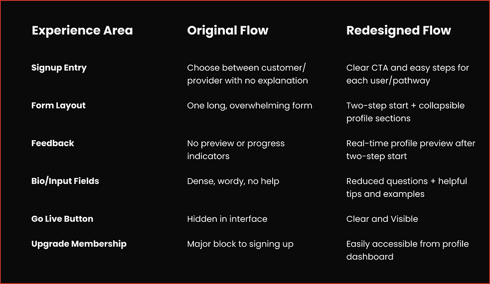
CONTENT AND UX REFINEMENTS
Reduced Input Fatigue:
Cut down on redundant questions like "Introduction", "Experience", and "What I do" into one section.
Default Branded Image:
Ensures every profile looks polished, even without uploading business images
Microcopy and Tips:
Help text, example bios, and subtle tips keep users on track and help them create strong content.
Clear "Go Live" CTA:
No more guessing --It's visible and actionable for users to publish their profiles.
Membership Upgrade:
Instead of making this part of the flow (a block to signing up), add it onto the profile page.
REFINING THROUGH FEEDBACK
After presenting the flow, I made three major adjustments based on stakeholder feedback:
-
Removed Time Estimates: like “~2 min to complete” after the CEO noted they might deter users from starting.
-
Adjusted the "Go Live" Button Styling: my original red CTA was too aggressive for the brand (in an attempt to draw attention), so we landed on a more visible but softer design to ensure it still stood out.


-
Removed the Second Signup Box: Instead, we added a clean, direct sign-up CTA in the hero section at the top of the provider landing page, making it immediately clear where and how to begin
-
At the CEO's request, we also added Google and Facebook signup options to streamline account creation and reduce friction for new users

Key UX Improvements: The New
High Fidelity
.png)
Two-Step Flow with Visual Cues & Suggested Search, Preview for User Control & Freedom, and Collapsible Profile for Reduced Cognitive Load

From Polish to Purpose: Key Results & Next Steps
UI POLISH CAN'T FIX BROKEN UX
This redesign didn’t just clean up the UI—it removed friction, clarified value, and set the stage for scalable growth. It:
-
Lowers the barrier to entry
-
Gives users more control and context
-
Builds trust by showing transparency and value early on
-
Supports long-term growth by encouraging upgrades
The key takeaway? Polish doesn’t solve for poor UX. By reframing the sign-up flow around progressive disclosure and user psychology, we made it not only look better—but work better.
KEY RESULTS
-
Achieved a projected 38% increase in provider sign-up completion rates through streamlined onboarding.
-
Reduced onboarding time by over 50% by simplifying the initial two-step process.
-
Collaborated with a cross-functional team, including the CEO, two developers, a project manager, and an SEO specialist, ensuring seamless handoff and alignment between design vision and engineering feasibility.


