Modernizing MedQuest's Website

.jpg)
An Outdated Design: Let Me Upgrade You
CONTEXT
MedQuest helps law firms cut through that complexity with medical record retrieval and case-building services. I led the redesign of their website experience to help legal teams find services faster, trust the platform, and take action for their clients.
Speak Now or Forever Hold Your Peace: What Legal
Professionals Value
.png)
WHAT USERS VALUE ABOUT WEBSITES
WHAT USERS VALUE ABOUT MEDQUEST
Saving time, money, upfront pricing
Communication, reliability, meeting deadlines
Flexibility of needs based on customer
MEET DANIEL: A PARALEGAL SEARCHING FOR TRUST & CLARITY
.png)
We first met Daniel, a paralegal at Ramos James Law, when mapping the MedQuest ordering flow case study (see here). Now, tasked with evaluating MedQuest for a malpractice case, poor navigation and missing information left him questioning MedQuest's credibility.
DANIEL'S PROBLEM STATEMENT
Daniel needs a centralized way to navigate and access clear, reliable information about MedQuest to evaluate their credibility and gain a better understanding of their services, enabling him to make an informed decision about partnering with them.
Mapping the Path to Clarity: How Navigation Improves UI
Competitor research showed that effective legal websites use simple, intuitive navigation, often organized into four clear sections: Home Page, About, Services, and Support
.png)
Implementing Credibility and Trust
.png)
Leading UX & UI: Brand Identity and Accessiblity
I led the UX strategy and UI design, collaborating with the brand copywriter to align content with MedQuest’s voice. I redesigned typography, icons, buttons, and layouts to create a cohesive, accessible system that reflects MedQuest’s rebrand. Every component followed WCAG 2.1 standards to ensure usability for all. Explore the UI MedQuest case study here.


Making the Full Picture Click: An Added Page
THE CHALLENGE: SERVICES WITHOUT A CLEAR MAP
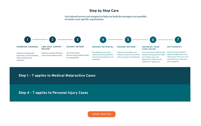
Early in the process, I identified a key gap: users couldn’t see how MedQuest supports every stage of a legal case. I proposed a dedicated, visual “Solutions for All Stages of Your Case” page under the "Services" section to communicate the full service offering clearly and intuitively.
Designing for both personal injury and medical malpractice pathways was complex. After several iterations, I created a clean, color-coded chart that maps each service to the right case type and litigation phase—giving legal teams a quick, trustworthy view of MedQuest’s value from intake to settlement.


Findings vs. Time Constraints: Testing
the Redesign
USABILITY TEST OBJECTIVES
Evaluate how successfully users can navigate the MedQuest website to understand and decide to purchase. Identify standout elements, areas of confusion, factors influencing decision-making, and any missing information that could aid users.

KEY FINDINGS AND THE ULTIMATE DECISION
-
Users wanted a more interactive, clickable “Build Your Case” chart.
-
There was confusion around the names of services that MedQuest offers.
-
More expert information was requested.
-
UX copy on Curbside Counsel needed rewriting.
-
The “Q” logo was mistaken for a sickle.
Due to workflow differences and launch timelines, the CEO prioritized essential fixes and postponed some enhancements (like interactive charts) to Phase 2. Meanwhile, the copywriter consultant worked on confusing text findings.
THE ONE THING THAT CHANGED OUR BRAND
In early designs, I refined the MedQuest “Q” to a half-circle for better visual balance. While this aligned with my UI vision, the CEO stressed protecting brand identity. Usability testing confirmed the original “Q” resembled a sickle, creating confusion. We landed back on a clean, neutral half-circle that preserved recognition without compromising clarity.


From Insight to Impact: Key Results &
What's Next
Designing MedQuest’s unauthenticated site challenged me to balance business goals with user clarity—especially across two distinct legal audiences. It pushed me to think beyond surface-level fixes and instead craft systems that build trust, simplify complexity, and guide users with confidence. Leading both UX and UI, I learned how to navigate stakeholder input, preserve brand identity, and design for scalability in a legal-tech context
KEY RESULTS
-
Achieved a 75% user satisfaction rate for ease of use in the redesigned website.
-
Boosted task completion rates by 30% in the medical case ordering system.
-
Consistently met 100% of project deadlines through efficient design iterations, close collaboration with developers, and implementation of multiple version goals.
WHAT'S NEXT?

Phase 2 Usability Enhancements
Prioritize key improvements from testing—like a more interactive “Build Your Case” experience.

Measure Business Impact
Partner with stakeholders to track conversion rates, user confidence, and operational efficiency post-launch.

Explore Patient-Facing Features
Evaluate opportunities to increase transparency, such as case progress notifications for patients.
This project reinforced a core belief: even in legal-tech, trust is designed—through clarity, empathy, and scalable, system-level thinking.
