A Nostalgic Experience on an Analog Level: Amoeba
Redesigned Amoeba's website to reflect its in-store brand, improving discovery and user engagement.


"Do You Believe in Magic?": Music's Effects on Humans
"I love music because it's an abstract thing that you can't see, but it's like magic; you can't see it" - USER
Amoeba music has the unique ability to immerse customers in a magic world of music through their vintage and nostalgic atmosphere, but therein lies the problem. The website was so antique, its design was difficult to use.
My task was to enhance their e-commerce platforms to showcase their products while preserving their "small shop" charm, vintage brand, and excellent customer service over the course of two weeks.
Amoeba's Charm


USER RESEARCH
Initially, I set out to determine users’ relationship with music and behaviors around online shopping. I found key motivators for these elements:
1. Music is an art and an experience.
2. Music harnesses nostalgia for users.
3. Users like to support local businesses and artists.
4. Users trust up-to-date websites.
5. When users receive a package in the mail, like a vinyl, they feel like it's Christmas morning.
Based on Findings, User Persona, Nick, was Born
.png)
The Problem: Amoeba's Website is like Shopping Blindfolded

What Nick Sees Online: Missing Information
NICK'S PAIN POINTS: NECESSARY MISSING INFORMATION TO ASSESS ARTIST
1. How can I filter the genre or see it easier?
2. Can I see the back or inside the album?
3. What are the song track names?
4. What other artists does this artist sound like?
5. What is the band, The Avett Brothers, like?
6. How did they make this album? Any inspirations?
7. What do they sound like?
8. Should I buy this album without knowing anything about it?
For Nick, shopping like this in-store would translate to being blindfolded and unable to soak in everything Amoeba’s brand offers: images, songs, and descriptions found on the album cover, and the similar artists in the surrounding section of the store.

What Nick Needs: Competitive Analysis
The competitive analysis informed us that Amoeba lacked access to more album art, lyrics, the ability to sample music, a recommended artist or similar artist section, an album description, and a track list in comparison to other major competitors.
NICK'S PROBLEM STATEMENT
Nick needs descriptions of the qualities artists have so that he can connect with the music on an analog level through the sound, feel, and vision of the artist and their music.
"Bring the Beat In": How might we Make the Search an Analog Experience?
The Process: Crazy 8's & Mind Maps


DESIGN DECISIONS
Out of all the ideas flying around, what would Nick want?
Product Listing Page

-
Interactive vinyl preview with spinning turntable and vintage sound to recreate the tactile, nostalgic experience.
-
Album art and lyrics to help Nick connect with the artist’s visual and lyrical identity.
-
Browse by year using Amoeba’s inventory database to easily find classic favorites.
Product Page

-
Show and donation details to help Nick support artists and feel connected to the Amoeba community.
-
Curated artist recommendations to deepen discovery and engagement.
-
Access to the Amoeba's podcast, “Earwax,” to enrich Nick’s music experience with behind-the-scenes insights.
"And Another One": Usability Test Findings Inform Iterations
USERS, TEST PURPOSE, & TASK
Users: 3
Test Purpose: Evaluate how users engaged with the analog-inspired experience, their ability to identify an artist’s sound, preferred search methods, perceived support for the artist, and success in completing a purchase.
Task: To find and buy a gift of vinyl for a friend who’s a big fan of the sounds of Nelly, Usher, Ashanti, and Alicia Keys.

"This is How We Do It": High Fidelity Magic
The High Fidelity was a crucial piece to bringing Amoeba’s magic to life. It had to mimic Amoeba’s alternative, old-school charm, yet adopt it to a less cluttered and cleaner design than the initial.
Attempt #1 Vintage Lens: Too Outdated, Tacky.
Attempt #2 Modern Lens: Clean, but lacking Amoeba's Vintage Vibe.
I ultimately blended modern organization with retro elements like a textured, tan background, electric flourishes and pops of their color palette, and specific band poster typefaces to balance a contemporary feel with Amoeba’s vintage and counterculture essence.
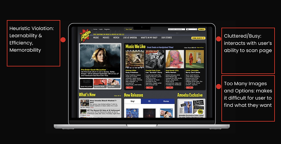
Original Home Page


Redesigned Home Page

Redesigned Product Page
Now, how would Nick Feel? Nostalgic. Engaged. Like Magic.
Ultimately, the redesign allows Nick to test the music, understand the sound, feel, and vision of the music, learn more about the history and process of the artist, and support the artist, all while maintaining Amoeba’s independent music store signature image. Nick can now confidently purchase and expand records for his collection from the comfort of his house, so that he can his listening parties with friends, bringing together .
"The Next Episode": Next Steps & Reflections
Although the redesigned site didn’t launch, I would have measured impact through:
-
Increased purchases and positive reviews, reflecting user satisfaction and confidence in purchase decisions.
-
Higher overall and vinyl page traffic, indicating improved discoverability and navigation.
-
Growth in online account sign-ups, suggesting greater trust and readiness to purchase.
-
Reduced click-through rate, signaling a more efficient path to purchase with the redesigned user flow.
NEXT STEPS FOR AMOEBA'S WEBSITE
Refining Artist Support:
Clarify the donation flow and explore how users prefer to support artists, ensuring transparency and trust in Amoeba’s role.
Explore Secondary Persona:
Design a sales section inspired by Amoeba’s in-store deals to support the budget-conscious user in future iterations.
REFLECTIONS

I learned how to refine my problem statement crafting skills through specifying and clarifying what our users truly needed, and through deep questioning, feedback, and refinement of UX Copy.
While diverging in ideation, Crazy 8’s and mind maps helped me expand creativity to bring to life what could be possible, to set viable options before settling on one final idea.
By seeking materials and guidelines to match brand identity, I became resourceful to help design something that successfully maintained company style.