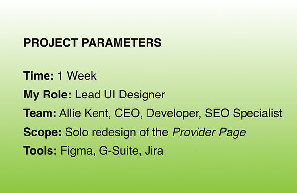
OHHLOOK: Provider Page UI Redesign

.jpg)
UI DESIGN: Cutting the Fluff & Restructuring the Information Architecture
THE PAGE THAT NEEDED A MAKEOVER
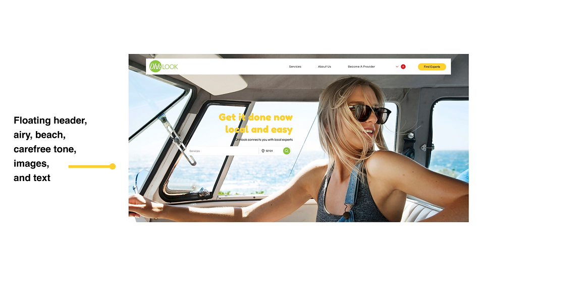
Ohhlook is a local services directory—think Craigslist—that connects people with neighborhood-based service providers. Currently focused on the Southern California region (hence the beachy feel), the platform offers users a way to discover and book trusted professionals in their area.
The provider page was previously dense, visually inconsistent, and struggled to quickly communicate its purpose. The company had recently redesigned its homepage, which provided a starting point for tone and style—As the lead designer on this project, I was responsible for improving the Provider Landing Page to better support user experience, usability, and evolving business needs.
THE PROBLEM
.png)
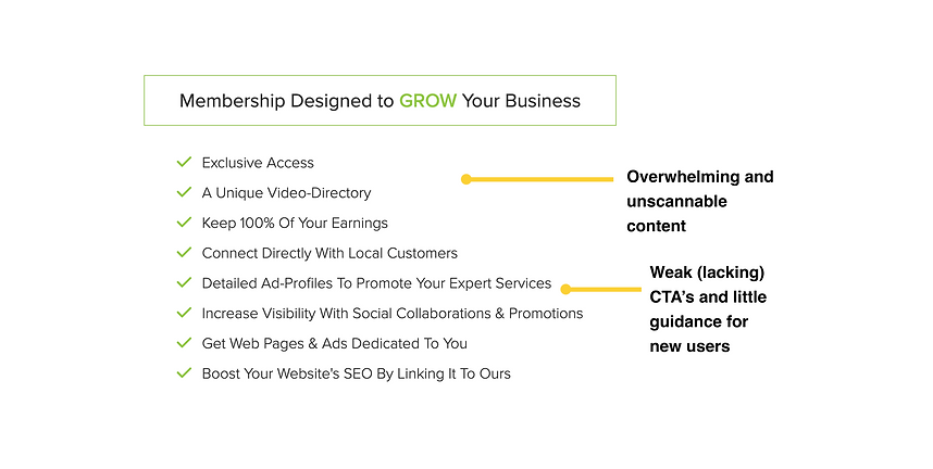
.png)
OBJECTIVES
REMOVE UNNECESSARY COPY & VISUAL CLUTTER
IMPROVE READABILITY & ACCESSIBILITY
CREATE A CLEAR, SCANNABLE VISUAL STRUCTURE
LEAD PROVIDERS TOWARDS A SINGLE, FOCUSED ACTION
FOLLOW TONE, LAYOUT, STRUCTURE OF REDESIGNED HOME PAGE
FROM CHAOS TO CLARITY: My Approach
CONTENT AUDIT AND COMPETITIVE ANALYSIS
-
I cut the "fluff," a.k.a., the marketing-heavy language to instead restructure the information architecture highlighting key information: What is Ohhlook? How can providers join? Why should providers join?
-
What do competitors offer? How do competitors draw users in and present information in a succinct and clear manner? (i.e. follow a clear, simple "How it Works")

WIREFRAME EXPLORATION
-
I designed a layout that guides the user from intro → easy signup → how it works → why providers love it → membership information and obvious CTA's throughout


VISUAL DESIGN & ACCESSIBILITY
-
I used Ohhlook’s newly redesigned homepage as a visual starting point, adapting the style while refining structure and sizing for this page
-
I established clear hierarchy using headings, contrast, and visual rhythm
-
I applied a restrained color palette to focus attention and reduce noise
.png)
.png)
-
I created a custom font and size guideline to establish consistency and ensure WCAG-compliant readability and increased base font sizes and spacing for improved legibility

PHASE 1: Initial Redesign
-
A streamlined, conversion-optimized provider page that clearly communicates Ohhlook’s value
-
Improved accessibility and readability across all devices with clear CTA's to get the user started
-
Positive stakeholder feedback on design clarity and usability
-
Delivered a typography and spacing system that could extend site-wide
.png)
.png)
.png)
PHASE 2: Usability Improvements Based on
Signup Redesign
As we wrapped up the initial Provider Landing Page updates, our team identified a bigger priority: simplifying the site’s sign-up flow — you can check that project out here. Throughout that redesign process, it became clear the original landing page still had friction points that could impact conversions. Equipped with fresh insights, we returned to the landing page with sharper focus.
WHAT CHANGED AND WHY
.jpg)
%20copy.jpg)
RESULT
The updated layout removed barriers for users, improved clarity, and created a more conversion-focused, user-centric experience — all aligned with real user behavior and business goals.
PHASE 3: SEO-Driven—Balancing Business
Needs with User Experience
Following the launch of the initial redesign, the CEO brought on an SEO specialist to boost OhhLook’s visibility—especially among San Diego users. While this strategy successfully enhanced discoverability, it also introduced new design challenges that required thoughtful iteration.
SEO CONTENT CHANGES
The SEO approach prioritized integrating San Diego-specific language throughout key pages to ensure both users and search engines quickly recognized the platform’s local focus. This impacted the Home Page and Provider Landing Page, requiring us to:
INTEGRATE LOCATION-SPECIFIC KEYWORDS IN HEADINGS AND BODY CONTENT
ACCOMMODATE ADDITIONAL TEXT ELEMENTS IN VISUALLY CRITICAL AREAS LIKE THE HERO SECTION

LAYOUT ADJUSTMENTS FOR CLARITY & VISUAL BALANCE
To address the increased content without overwhelming the user, I redesigned key layout areas—removing the original hero background and reorganizing content for improved clarity and visual harmony. These adjustments ensured the page remained clean, readable, and visually appealing while supporting OhhLook’s growth goals.
%20copy%203.png)
These changes illustrate how close collaboration with SEO specialists can align business objectives with a strong user experience. Through intentional design decisions, we preserved clarity and usability while meeting evolving company needs.
THE POWER OF SIMPLICITY: Reflections
This project reflects how design is never static. By iterating across three phases — visual hierarchy, usability improvements, and SEO-driven refinements — I ensured the Provider Landing Page stayed aligned with both user needs and evolving business goals.
The final product is proof that clean design doesn’t mean static design. By listening to user needs, stakeholder input, and competitive signals, we created a page that feels intuitive, credible, and conversion-ready — without saying more than it needs to.
NEXT STEPS
With the successful redesign of the provider page, the next phase involves further improvements across the site:

Track and Optimize Conversion Performance
Monitor sign-up rates, scroll behavior, and social login adoption to assess the impact of the final adjustments and identify further opportunities for improvement.

A/B Test High-Impact Sections
Experiment with hero messaging, testimonial formats, and value propositions to determine which combinations most effectively drive provider sign-ups.

Expand Font Size and Accessibility Guidelines
Apply the newly established font sizes and accessibility standards to other pages across the website, ensuring a consistent and user-friendly experience.
Review the homepage and other sections to align typography with WCAG guidelines, improving overall legibility for all users.