MEDQUEST: A Website Redesign

%20copy.jpg)
DESIGNING CLARITY FOR COMPLEX LEGAL WORK
Behind every medical case is a human story—often tangled in paperwork, stress, and urgency. Legal professionals rely on platforms like MedQuest to cut through that complexity and advocate for their clients with confidence. In this project, I led the redesign of MedQuest’s unauthenticated and authenticated website experience, aiming to make it easier for lawyers to evaluate services, trust the brand, and act quickly on behalf of the people they represent.
THE PROBLEM: OUTDATED AND OVERLOADED
MedQuest’s homepage lacked structure and clarity. No global nav, buried CTAs, and a cluttered layout made it hard for users to find information or trust the brand. The site felt outdated—hurting credibility and usability.

COMPETITIVE GAPS: WHERE MEDQUEST FALLS BEHIND
Competitive analysis suggested that MedQuest was missing some key features that their competitors offer, leaving them to fall behind.
.png)
%20copy%202.png)
Through interviews with MedQuest clients, I uncovered key insights into what lawyers and legal support professionals prioritize when researching a company—essentially, what they value most in a legal services partnership.

WHAT DO USERS CURRENTLY VALUE ABOUT MEDQUEST?
SAVING TIME, MONEY, UPFRONT PRICING
COMMUNICATION, RELIABILITY, MEETING DEADLINES
FLEXIBILITY OF NEEDS BASED ON CUSTOMER (DEADLINES, PRICING, ETC.)
REMEMBER DANIEL? A PARALEGAL SEARCHING FOR TRUST & CLARITY
We met Daniel, our handy paralegal when we went over the ordering services flow (see here). In this case study, we learned more about Daniel, a paralegal at Ramos James Law, tasked with researching MedQuest to assess their credibility and services for a malpractice case. But poor navigation and missing information left him uncertain—and questioning whether the firm could be trusted.
.png)
DANIEL'S PROBLEM STATEMENT
Daniel needs a centralized way to navigate and access clear, reliable information about MedQuest to evaluate their credibility and gain a better understanding of their services, enabling him to make an informed decision about partnering with them.
Competitor research revealed that successful legal websites prioritize clear, intuitive navigation. Most rely on four key areas, keeping the structure simple and easy to use without overwhelming users with too many options.

"IT'S NICE TO MEET YOU": CREATING A CLEAR FIRST IMPRESSION
I took key features in order to build credibility and trust to MedQuest's name. They were:

LEADING UX AND UI: Building with Brand
and Accessibility in Mind
In addition to leading the UX strategy, I partnered closely with the brand copywriter consultant to refine and edit the copy, ensuring it aligned seamlessly with MedQuest’s brand voice and messaging. I also led the UI design to create a cohesive, credible, and accessible visual system. This involved redesigning typography, iconography, buttons, spacing, and layout grids to reflect MedQuest’s rebrand. Every component adhered to WCAG 2.1 guidelines—enhancing contrast, type hierarchy, and mobile responsiveness—to support users of all abilities. Explore the UI MedQuest case study here.

FROM INTAKE TO SETTLEMENT: Showcasing MedQuest's Full Legal Support
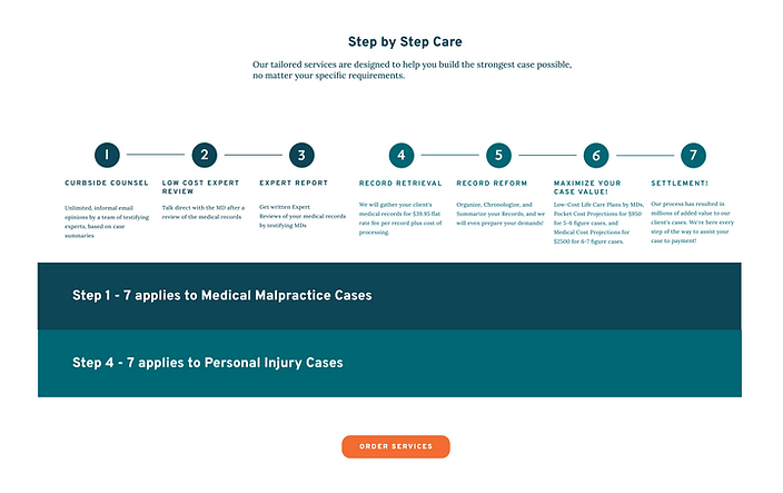
The “Solutions for all Stages of Your Case” page was born from a post-launch collaboration between me and the COO, who appreciated how I showcased MedQuest’s full service offering. To reinforce that MedQuest supports the entire litigation process—not just one-off services.
Designing for both personal injury and medical malpractice pathways was a challenge. Charts were often too big or difficult to differentiate between. After several iterations and a focused design brainstorming session, I developed a color-coded chart that clearly connects each service to the appropriate case type and litigation phase. The final result gives users a quick, intuitive view of MedQuest’s comprehensive value.


TESTING THE REDESIGN: Findings vs. Time Constraints
USABILITY TEST OBJECTIVES
Evaluate how successfully users can navigate the MedQuest website to understand and decide to purchase. Identify standout elements, areas of confusion, factors influencing decision-making, and any missing information that could aid users.

KEY FINDINGS AND THE ULTIMATE DECISION
Key Findings:
-
Users wanted a more interactive “Build Your Case” chart with clickable stages.
-
There was confusion around the names of services that MedQuest offers.
-
Users wanted more information on the experts, themselves.
-
The UX copy on Curbside Counsel was confusing and needed to be rewritten.
-
Users expressed the "Q" looked like a sickle.
However, after going over all findings and proposed solutions with the CEO, due to fundamental differences between personal injury and medical malpractice workflows, not all findings applied across the board. Additionally, with time constraints and a push to launch, the CEO recommended saving several enhancements (such as interactive charts) for Phase 2.
THE ONE CHANGE THAT SAVED OUR BRAND
In the initial designs, I adjusted the MedQuest “Q” to a half-circle to create better visual balance. While this direction aligned with my UI vision, the CEO emphasized the importance of preserving brand identity. After usability testing revealed that the original “Q” resembled a sickle—creating an unintended and distracting association—we refined the design to a cleaner, more neutral half-circle that maintained brand recognition without compromising clarity.


FROM INSIGHT TO IMPACT: What's Next
Designing MedQuest’s unauthenticated site challenged me to balance business goals with user clarity—especially across two distinct legal audiences. It pushed me to think beyond surface-level fixes and instead craft systems that build trust, simplify complexity, and guide users with confidence. Leading both UX and UI, I learned how to navigate stakeholder input, preserve brand identity, and design for scalability in a legal-tech context
WHAT'S NEXT?

Phase 2 Usability Improvements
Revisit and implement key usability findings—like improved onboarding, clearer service distinctions, and a more interactive “Build Your Case” experience.

Track Measurable Impact
Collaborate with the team to measure whether the redesign improves case processing speed and conversion rates.

Explore Patient-Facing Features
Consider a notification system that gives patients visibility into case progress, enhancing transparency and peace of mind.
This project reminded me that even in technical or legal spaces, trust is earned through clarity, empathy, and strong visual communication. I look forward to continuing to design experiences that empower users through thoughtful, scalable systems.